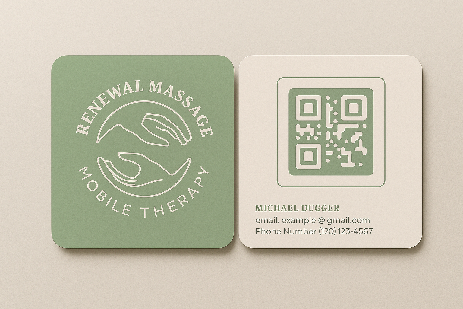
RENEWAL MASSAGE | Health and Wellness Brand
Create a calming, professional brand identity for a freelance massage therapist offering mobile services. The goal: to build immediate trust, especially with clients new to bodywork, and create simple packaging for oils and leave-behind materials that reinforced the sense of care and credibility.

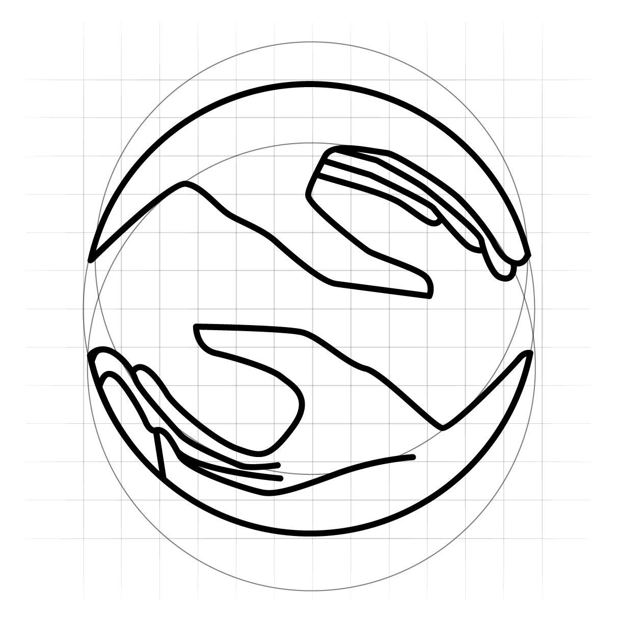
Symbol of balance
Tool of a masseuse
Healing hands